When popular harbors fill with sterns aimed the same direction, every yacht name competes for attention in real life, on camera, and from a distance at anchor. Crowded seasons do not change the quality of your build, but they do change how much contrast, scale, and finish discipline matter. This guide translates that reality into fabrication decisions you can discuss with your yard or lettering supplier.
Why Dense Anchorages Change Readability
In a quiet quay, guests read your name from a few meters away. In a busy roadstead, viewers may pick you out from a neighboring transom, a launch ride, or a wide phone panorama where dozens of white tops blend together. The design task shifts from “looks elegant at the dock” to “remains a clear silhouette under tropical sun and mixed lighting.”
That is a professional signage problem: contrast, stroke weight, spacing, and finish behavior across the day. It is not about who is moored next to you; it is about maintaining a legible wordmark when visual noise goes up.
Contrast, Hull Color, and Finish Choice
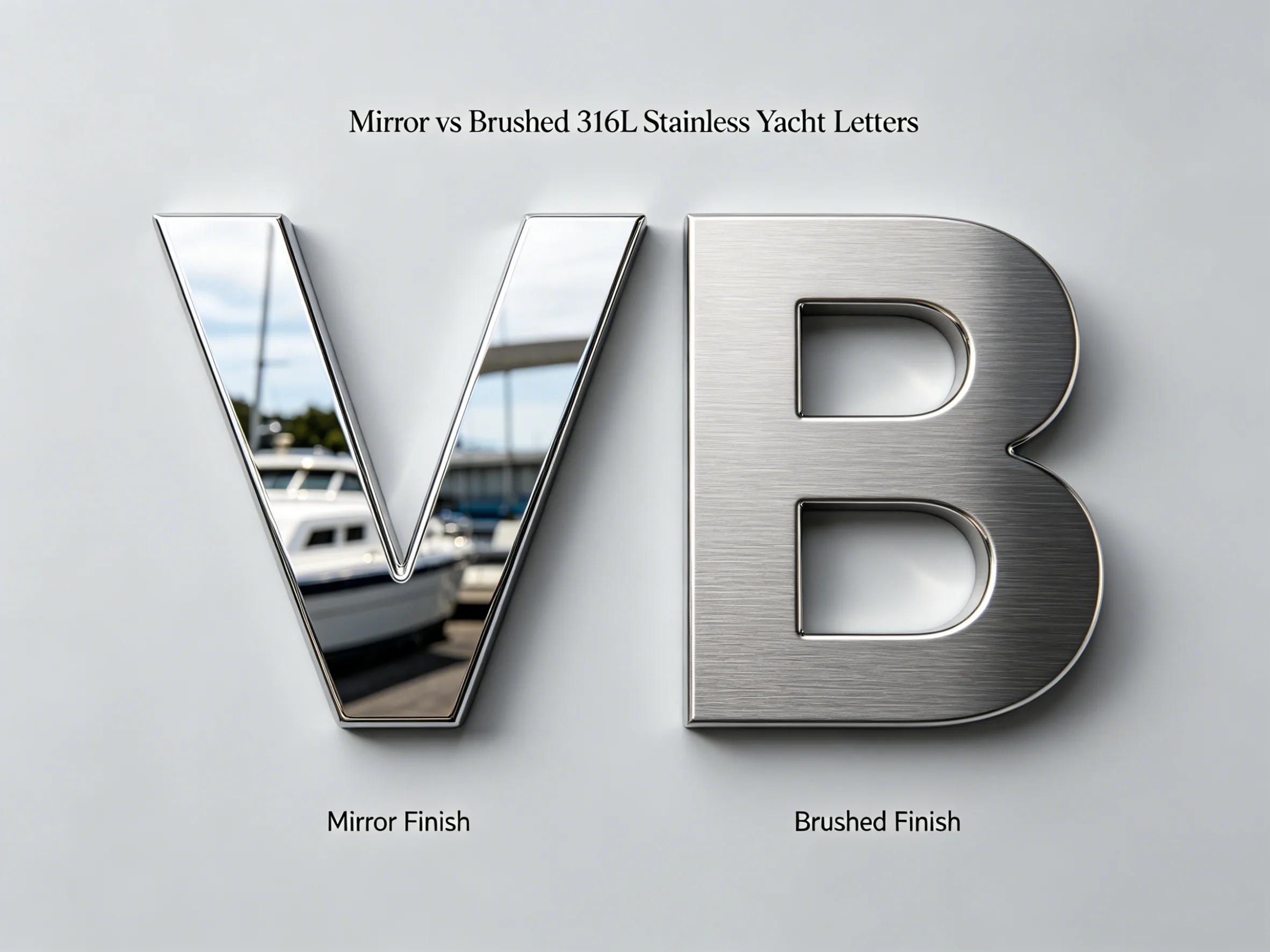
Dark hulls can swallow thin metal strokes unless you tune finish and lighting. Light gelcoat can throw glare back at mirror polish, which sometimes reads as a bright rectangle instead of crisp letterforms. Brushed or satin stainless often behaves calmly in harsh sun while still feeling premium.
Start with alloy truth: marine-grade 316L remains the default serious choice for welded metal letters in salt air. Review 316L stainless steel, then compare daytime behavior on brushed versus mirror finishes before you lock artwork.
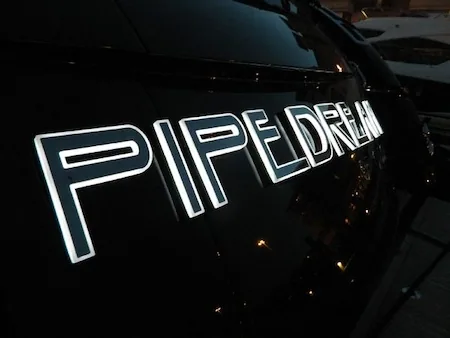
High-readability yacht lettering visible from distance in harbor conditions. View Gallery.
Premium finish yacht sign example for busy-season transom visibility. View Portfolio.
Letter Height, Stroke Weight, and Spacing
Undersized names disappear in fleet photos; ultra-thin font weights that look beautiful in a PDF can lose interior counters when fabricated at real height. Work back from the farthest distance you care about—fairway sightlines, med-mooring pickup, or common drone altitudes your crew uses—and validate a physical mockup or dimensioned render on the transom plane.
- Tight letter pairs: track combinations like AW, RN, or IL so fabrication remains distinct.
- Descenders: ensure clearance to swim platforms, doors, and hull curves so letters do not collide with hardware.
- Studs and welding: thin strokes still need enough metal for structure and optional LED routing.
Photography, Guests, and Night Identification
Charter guests and brokers often meet the yacht first through a wide-angle image. If your program depends on clear identification from off-boat angles, spec lettering the same way you would spec navigation lights: predictable contrast and predictable maintenance.
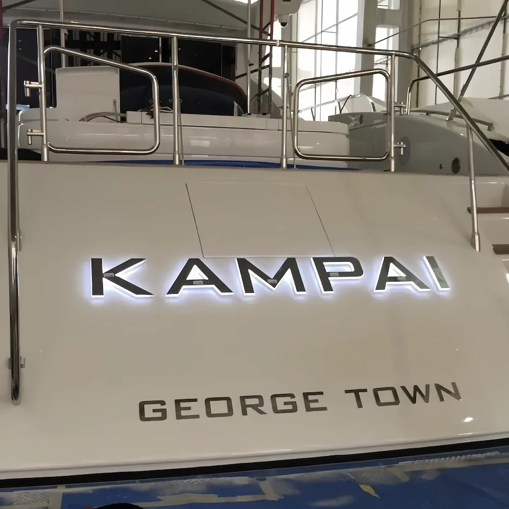
Optional halo or face-lit LED can separate the wordmark from busy backgrounds after dark without turning the transom into a billboard. Compare effect vocabulary on lighting options and read illuminated yacht signage before you commit to cable paths and driver locations.
Salt Spray, Polish Cycles, and Peak Season
High-traffic seasons usually mean more salt film on transoms, more freshwater rinses, and more finger smudges from lines and fenders. Quality metal letters still need a sane maintenance rhythm. Follow the routines in how to maintain stainless steel boat letters and keep aggressive abrasives off polished faces.
If you are comparing substrates and coatings at a materials level, cross-check best materials for yacht exterior signage before you mix vinyl, acrylic, and metal on the same plane.
Checklist Before You Request a Quote
- Transom photos in morning and afternoon sun on a representative season week.
- Mounting substrate notes: gelcoat, paint system, core type if known, and insulation requirements.
- Letter height targets tied to real viewing distances, not only aesthetic preference.
- Finish decision with maintenance expectations (mirror vs brushed vs specialty PVD if offered).
- Lighting intent: none, halo for identification, or integrated face glow with electrical planning.
Planning a rename before high season?
FAQ
Scale letter height to the farthest distance you care about—often a marina fairway, a med pickup line, or a typical photo angle from a neighboring transom. Undersized names disappear when many sterns compete in one frame. Share those distances with your fabricator so height, stroke weight, and spacing stay readable.
Brushed and satin finishes often reduce specular glare on bright days, which can help legibility against light gelcoat. Mirror polish can pop dramatically but may throw hard reflections in tropical sun. Pick the finish that matches hull color, transom geometry, and how often you want to polish.
Thin strokes and low contrast against hull paint are the usual culprits. Increase interior counter space in letters, avoid ultra-light weights at small physical sizes, and validate mockups against your hull color in direct sun. Optional halo LED can separate the wordmark from busy backgrounds at night.
Backlighting can help crew and guests pick out your transom in a packed anchorage after dark. Treat it as a marine electrical project with sealed assemblies and service access. If identification is the goal, prioritize even halo and glare control over maximum brightness.
Send straight-on transom photos in morning and afternoon sun, approximate freeboard, mounting substrate notes, hull color codes if available, and examples of viewing distances you care about. Vector artwork or a fabrication-ready redraw speeds quoting and reduces rework.