

A yacht name should feel inevitable on the transom—not like a separate product bolted on after the design brief closed. Matching your yacht sign with your boat's interior and exterior aesthetics means treating lettering as part of the same visual system as hull color, brightwork, salon metals, and evening lighting. Whether you are specifying a new build, planning a yacht refit, or reviewing proposals from a shipyard sign supplier, the right material and finish choices make the name look designed with the vessel—not applied afterward. This guide maps three common style families—streamlined modern, classic timber, and rugged explorer—to practical signage decisions owners, captains, and naval architects can put in a brief.
Start With the Vessel Story, Not a Catalog Finish
Before you pick mirror polish or brushed grain, write one sentence that describes how the yacht should feel from the dock and from the salon doorway. That sentence becomes the filter for typography, metal finish, and optional glow.
- Modern / sport / flybridge express: clean planes, flush hardware, cool neutrals, architectural lighting.
- Classic / heritage / wooden motor yacht: warm timber, varnish, cream or dark hulls, softer specular highlights.
- Explorer / expedition / utility-luxury: purposeful hardware, high freeboard, matte or semi-matte coatings, legibility over flash.
A coherent custom yacht sign program starts with that story—then selects alloy, finish, and lighting that survive salt spray without breaking the mood. For finish optics in depth, compare mirror vs brushed 316L before artwork freezes.
The Three Levers: Material, Color Optics, and Lighting
Owners often ask for a “color,” but exterior metal lettering is mostly about how light behaves on the surface and against the hull. Keep these three levers in the naval architect specification or refit folder:
- Material: marine-grade 316L stainless steel remains the default for exterior durability; alloy choice sets corrosion resistance, finish choice sets character.
- Color optics: mirror reads bright and cool; brushed reads quieter and warmer; both sit differently on navy, black, white, and cream gelcoat.
- Lighting: daytime presence is finish-driven; night presence comes from sealed LED systems—see illuminated yacht signage and lighting options.
Material context for salt exposure lives in best materials for yacht exterior signage. Do not let a showroom sample under indoor LEDs override a midday photo of your actual transom.
Style 1: Streamlined Modern Yachts
Contemporary sport yachts and minimalist motor yachts reward restraint. The name should read as architecture—aligned with window mullions, radar arches, and hardtop lines—rather than as jewelry bolted onto a sculpted stern.
- Typography: geometric sans-serif with even stroke weight and open counters; avoid heavy scripts unless the brand story demands it.
- Finish: mirror stainless steel on dark hulls for crisp specular edges; finely brushed on white or pale topsides to reduce midday glare.
- Lighting: cool white or tunable halo glow that matches interior cove temperature; keep effects subtle unless the owner wants a night statement.
- Interior echo: if the salon uses brushed stainless, black glass, and cool LEDs, let exterior grain and Kelvin temperature follow—do not introduce warm gold accents only on the transom.
Browse current directions in yacht signage design trends for 2026, then lock proportions against marina sightlines, not only CAD renders.
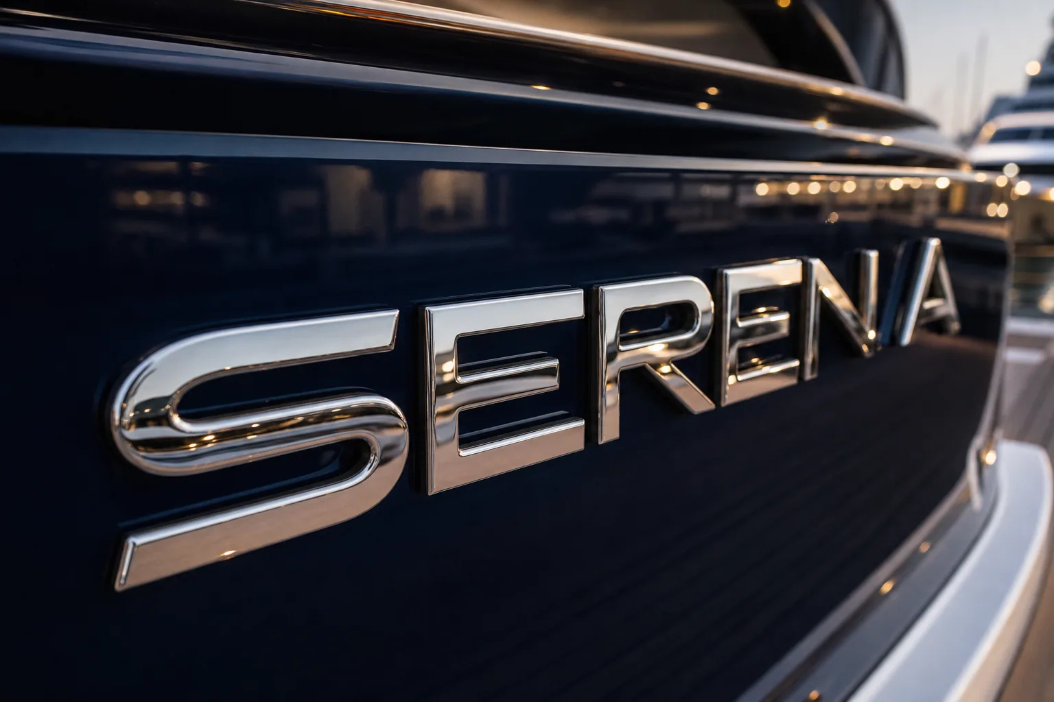
Mirror 316L on dark gelcoat — modern silhouettes favor crisp specular contrast. Mirror Stainless Steel.
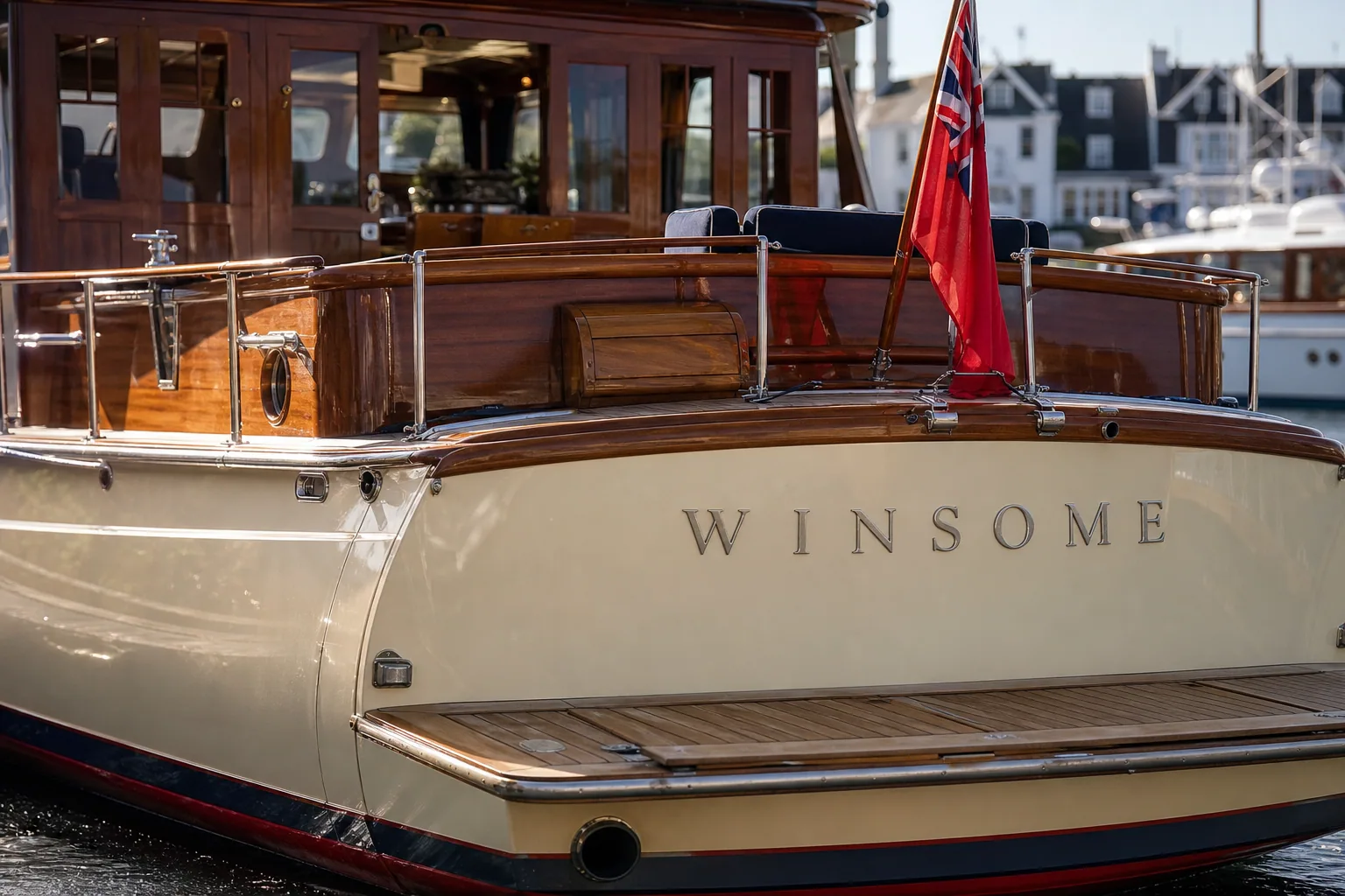
Softer metal on classic timber programs — brushed finishes echo varnish without competing with brightwork. Brushed Stainless Steel.
Style 2: Classic Wooden and Heritage Yachts
Timber decks, mahogany joinery, and cream or dark traditional topsides ask the name to feel handcrafted—not industrial. High-flash mirror can look “too automotive” next to varnish and canvas unless the rest of the hardware is equally specular.
- Typography: restrained serif or classic script with open counters; long names need generous tracking so curves do not collapse at distance.
- Finish: brushed or satin 316L usually complements teak and varnish; soft reflectivity reads warmer beside wood grain.
- Lighting: warm white single-color halo often pairs better with classic salons than cool RGB effects; keep glow even and low-glare for stern-to berthing.
- Interior echo: match the “temperature” of salon metals—brass-adjacent warm tones call for softer stainless grain, not chrome-like flash on the transom alone.
If night identification still matters for Med or Caribbean berthing, pair classic daytime finishes with sealed single-color LED rather than forcing a mirror program that fights the timber story.
Style 3: Explorer and Expedition Yachts
Explorer aesthetics prioritize purpose: high freeboard, protected decks, matte or semi-matte coatings, and hardware that looks ready for remote cruising. Lettering should read clearly in spray, low sun, and busy commercial docks—not disappear into fashion-thin strokes.
- Typography: sturdy sans or slab-inspired forms with generous stroke weight; prioritize dock legibility over ornamental detail.
- Finish: brushed 316L hides fine handling marks and reduces glare on light or utilitarian coatings; reserve mirror for dark hulls only when maintenance cadence is realistic.
- Lighting: warm or neutral single-color systems for night approach; RGB show modes are usually secondary to operational readability—see LED yacht lettering for night approach.
- Interior echo: expedition interiors often mix durable fabrics with satin metals—keep exterior lettering in the same quiet metal family so the brand feels consistent from salon to swim platform.
Durability specs still matter: correct alloy, passivation, and stud sealing protect the aesthetic investment through long passages—review yacht sign fitting before penetrations are cut.
Finish and Style Matching Matrix
Use this side-by-side when owners, designers, and a shipyard sign supplier need a shared starting point:
| Vessel aesthetic | Preferred finish | Typography cue | Lighting cue |
|---|---|---|---|
| Streamlined modern | Mirror on dark hulls; fine brush on pale topsides | Geometric sans, open spacing | Cool/tunable halo; restrained effects |
| Classic timber / heritage | Brushed or satin 316L | Restrained serif or open script | Warm white single-color |
| Explorer / expedition | Brushed 316L, high contrast | Sturdy sans, generous stroke | Neutral/warm operational glow |
Treat the matrix as a brief starter—not a rulebook. Hull color, freeboard, and registry marking requirements can override aesthetic preference; when compliance and style collide, prioritize legibility and durable contrast first.
Align Exterior Lettering With Interior Design
Interior and exterior do not need identical fonts, but they should share a family resemblance: weight, warmth, and metal character. Practical ways to keep continuity without forcing a logo lockup:
- Metal temperature: cool brushed salon fittings → cooler exterior grain; warm lacquered joinery → softer satin exterior metal.
- Light temperature: match Kelvin intent between salon cove lighting and optional letter halo so evening photos feel like one vessel.
- Typography character: if interior wayfinding is geometric sans, avoid a conflicting ornate script on the transom unless hierarchy is intentional.
- Accent discipline: one accent story—do not mix high-chrome exterior letters with matte-black interior hardware unless the design brief calls for contrast.
Share salon and transom photos together when requesting a layout so fabrication can propose finish samples against both planes—not only the stern. Explore finished references in the gallery before you lock a direction.
Need a finish and typography direction matched to your hull and salon?
Spec Checklist for Owners, Captains, and Shipyards
Add these lines to the refit folder or yard meeting notes before templates are cut:
- One-sentence aesthetic brief (modern / classic / explorer—or a hybrid with primary + secondary cues).
- Hull and superstructure colors with midday photos of the mounting plane.
- Interior metal and lighting references (finish samples or clear photos).
- Finish target: mirror, brushed, or mixed hierarchy with grain direction noted.
- Typography direction and minimum height for dock legibility / flag marking.
- Lighting intent: none, warm single-color, cool white, or controlled RGB—with driver location on drawings.
- Lead time aligned with paint and sea trials—see refit yard timing for custom lettering.
When the brief is clear, fabrication becomes selection—not guesswork—and the name reads as part of the yacht’s architecture from the first broker photo.
FAQ
How do I match a yacht sign finish to my hull color?
Photograph the mounting surface under midday sun and choose contrast first: mirror 316L typically pops on dark navy or black gelcoat, while brushed or satin softens glare on white and pale topsides. Confirm the finish against your actual paint—not a stock brochure—before artwork freezes.
Should interior design influence exterior yacht lettering?
Yes, when the goal is brand continuity. Echo interior metal tones, lighting temperature, and typography character without copying joinery details onto the transom. A modern salon with brushed fittings usually wants quieter exterior grain; a lacquered classic interior often pairs with warmer brushed or soft-satin metal and restrained scripts.
What yacht sign style fits a modern sport yacht?
Lean toward geometric sans-serif letterforms, mirror or finely brushed 316L, and optional cool-white or tunable halo lighting. Keep stroke weight disciplined and spacing open so the name reads as architecture, not ornament—especially on flush, low-profile transoms.
What finish works best on classic wooden yachts?
Brushed or satin 316L usually complements teak, mahogany, and cream topsides better than high-flash mirror. Softer reflectivity echoes timber grain and varnish without competing with brightwork. Classic scripts can work when counters stay open and stroke weight remains legible from the dock.
How should explorer and expedition yachts specify lettering?
Prioritize durability, contrast, and legibility over jewelry flash. Brushed 316L with generous stroke weight, high contrast against the hull, and optional warm single-color LED for night approach typically fit expedition programs. Avoid ultra-thin fashion fonts that fail in spray and polar glare.


