

The yacht name is the first handshake from the dock—and the typeface carries more personality than many owners expect. Classic script vs. modern sans-serif is not a fashion duel; it is a practical decision about how the vessel should feel: heritage and romance, or architecture and calm authority. Whether you are specifying a new build, planning a yacht refit, or aligning artwork with a shipyard sign supplier and naval architect specification, this font selection guide for yacht names explains the psychology behind each family, how prestige reads at marina distance, and how to keep letterforms legible once they become three-dimensional metal.
Why Font Psychology Matters on the Transom
People do not “read” a yacht name the way they read a menu. From fifty meters away they register silhouette, stroke rhythm, and contrast—then assign a personality. That snap judgment is font psychology in the marina: curves feel personal and ceremonial; geometric uprights feel engineered and contemporary.
- Script signals: hospitality, romance, heritage, owner presence, celebration.
- Sans-serif signals: clarity, modernity, restraint, technical confidence, quiet luxury.
- Prestige is not ornament: prestige comes from proportion, finish, and fit to the hull—not from adding more flourishes.
Treat typography as part of the same visual system as hull color and salon metals—see matching yacht sign aesthetics—so the name feels inevitable, not decorative afterthought. A durable custom yacht sign program starts with that personality brief, then translates it into stroke weight that survives salt spray and dock sightlines.
Classic Script: Personality, Ceremony, and Soft Prestige
Classic script letterforms borrow the language of handwritten invitations and heritage marques. On timber motor yachts, cream topsides, and varnish-forward programs, a well-drawn script can make the vessel feel owned rather than branded.
- Owner personality cues: hospitality, romance, family legacy, Med lifestyle, celebration of the name itself.
- Prestige cue: soft prestige—craft, continuity, and ceremony—rather than sharp architectural flash.
- Best vessel fits: classic wooden yachts, heritage motor yachts, and names with emotional or personal etymology.
- Risks: closed counters, colliding swashes, and ultra-thin joins that disappear at distance or in spray.
Scripts succeed when counters stay open, joins stay robust enough for fabrication, and tracking gives long names room to breathe. If flag marking demands “clearly legible” daytime characters, review constraints in legal requirements for yacht names before you fall in love with a fashion script that fails the dock test.
Modern Sans-Serif: Calm Authority and Architectural Luxury
Modern sans-serif forms speak the language of contemporary naval architecture: flush planes, disciplined mullions, and hardware that looks intentional rather than ornamental. On sport yachts, explorer programs, and dark gelcoat silhouettes, geometric sans lettering often reads as quiet wealth—the luxury of not needing decoration.
- Owner personality cues: clarity, modernity, discretion, performance mindset, brand-like consistency.
- Prestige cue: architectural prestige—proportion, alignment, and metal finish do the status work.
- Best vessel fits: streamlined flybridge expresses, minimalist motor yachts, and expedition boats that prioritize operational readability.
- Risks: fashion-thin strokes and overly tight tracking that look elegant in CAD but fail in glare and spray.
Sans-serif programs pair naturally with mirror stainless steel on dark hulls and with quieter brushed grain on pale topsides. Browse current directions in yacht signage design trends for 2026, then lock proportions against marina photos—not only renders.
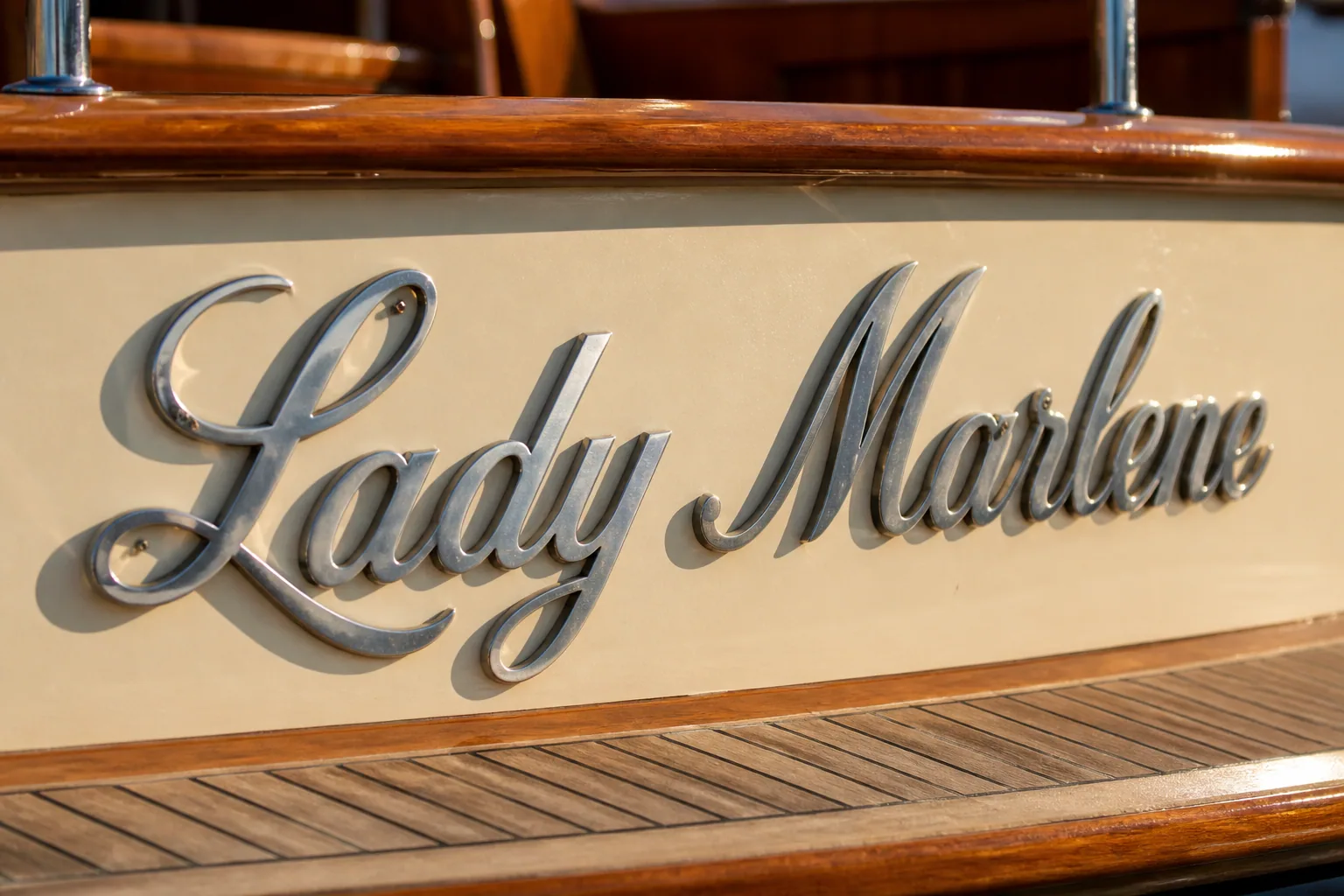
Open-counter script on a classic stern — ceremony and owner personality without collapsing at dock distance. Brushed Stainless Steel.
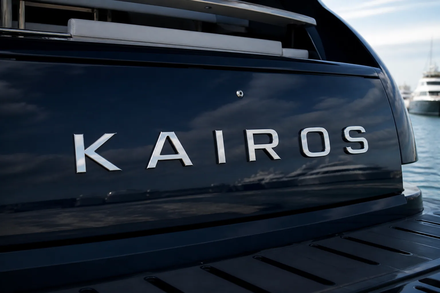
Geometric sans on a modern dark hull — architectural luxury through proportion and even stroke weight. Mirror Stainless Steel.
Font Selection Guide: Script vs Sans Side by Side
Use this comparison when owners, captains, designers, and a shipyard sign supplier need a shared starting point for yacht name typography:
| Decision factor | Classic script | Modern sans-serif |
|---|---|---|
| Personality signal | Romantic, personal, ceremonial | Calm, modern, discreetly confident |
| Prestige language | Heritage craft and invitation elegance | Architectural restraint and precision |
| Best aesthetic fit | Timber, cream topsides, classic brightwork | Flush modern hulls, explorers, dark gelcoat |
| Dock legibility | Strong only with open counters and robust joins | Generally stronger when stroke weight is generous |
| Long names | Need generous tracking; watch swash collisions | Easier to keep even rhythm across many letters |
| Night presence | Warm single-color halo often feels natural | Cool/tunable halo can reinforce architecture |
Neither family is “more luxury.” Prestige fails when the typeface fights the vessel story—or when stroke weight is too delicate for marine distance. Finish still shapes how either family reads; compare mirror vs brushed 316L once typography direction is clear.
How Font Choice Conveys Owner Personality
Owners rarely say “I want geometric grotesk.” They describe how they want to be perceived when the yacht arrives. Translate personality language into type decisions:
- “Warm, welcoming, family boat”: restrained classic script or soft serif hybrid; avoid aggressive condensed sans.
- “Quiet, contemporary, design-led”: geometric sans with open spacing; avoid ornate swashes that feel costume.
- “Capable explorer / go-anywhere”: sturdy sans with generous weight; prioritize contrast over jewelry detail.
- “Celebratory Med lifestyle”: open script can shine—if height and counters still pass the dock test.
- “Corporate or charter-facing brand”: sans or disciplined serif usually photographs more consistently for marketing decks.
Personality should still survive fabrication: metal letters have minimum practical stroke widths, and illuminated cavities need enough interior volume for sealed LEDs—see illuminated yacht signage and lighting options.
Prestige Without Overdesign: Proportion Beats Flourish
On luxury vessels, prestige is often misread as “more decoration.” In exterior lettering, prestige is usually the opposite: confident scale, even rhythm, metal that looks intentional against the hull, and lighting that supports the name without turning it into a nightclub sign.
- Scale: legal minimum height is not a design target—size for marina recognition and hierarchy with the hailing port line.
- Rhythm: consistent letter spacing reads wealthier than cramped custom kerning that collapses at distance.
- Finish discipline: one metal story—mirror or brushed—aligned with other exterior hardware.
- Lighting restraint: warm or cool single-color elegance vs show modes; choose based on vessel story, not catalog novelty—see RGBW vs single-color LED.
A restrained sans on a dark modern hull can feel more expensive than an overworked script on the same boat. Conversely, a carefully drawn script on teak and varnish can feel more exclusive than a generic condensed sans that looks borrowed from a brochure template.
Choosing between classic script and modern sans-serif for your yacht name?
Practical Spec Checklist for Owners and Yards
Add these lines to the refit folder or yard meeting notes before artwork freezes:
- One-sentence personality brief (ceremony / quiet modern / explorer / brand-led).
- Primary type family: classic script, modern sans-serif, or hybrid hierarchy (name vs port).
- Name length and preferred casing; note any letters that create closed counters in script.
- Minimum height for dock legibility and any flag marking floors.
- Stroke-weight floor suitable for 316L fabrication and optional LED cavities.
- Finish target and hull contrast photos under midday sun—see 316L materials.
- Lighting intent and driver location if illuminated; mounting notes via yacht sign fitting.
- Lead time aligned with paint and sea trials—see refit yard timing for custom lettering.
When personality, prestige, and legibility are written into one brief, fabrication becomes selection—not guesswork—and the name reads as part of the yacht’s architecture from the first approach photo.
FAQ
Is classic script or modern sans-serif better for a luxury yacht name?
Neither is inherently more luxurious. Classic script conveys ceremony and personal heritage on timber or traditional aesthetics; modern sans-serif conveys architectural restraint on contemporary and explorer vessels. Prestige comes from proportion, stroke weight, finish, and fit to the hull—not from choosing the more ornamental font.
How does font psychology affect yacht name design?
From the dock, people assign personality before they finish reading every letter. Script tends to signal warmth, romance, and owner presence; sans-serif tends to signal clarity, modernity, and quiet confidence. Match that signal to how the owner wants the vessel to feel when it arrives—and verify the forms stay legible at marina distance.
Can a script font meet yacht name legibility and marking rules?
Yes, when counters stay open, joins are robust, stroke weight is sufficient, and contrast against the hull remains clear in daylight. Ultra-thin fashion scripts and closed swashes often fail “clearly legible” expectations even when letter height meets a legal minimum. Approve full-size proofs against real transom photos before cutting metal.
What font works best on a modern sport yacht?
Geometric or neo-grotesk sans-serif with even stroke weight and open spacing usually fits flush, contemporary hulls. Pair with mirror or finely brushed 316L and restrained halo lighting so the name reads as architecture. Avoid heavy ornamental scripts unless the brand story intentionally contrasts with the modern silhouette.
Should the hailing port use the same font as the yacht name?
Not always. Many programs keep the primary name in the personality typeface and set the port line in a quieter, more legible companion—often a related sans or restrained serif—at smaller size but still above any legal floor. Hierarchy should feel intentional, not like two unrelated brands sharing one stern.


