

A yacht name that looks perfect on a CAD overlay can vanish from the dock if it sits on the wrong plane. Yacht name placement—transom versus quarters versus flybridge—is not a mood-board choice first. It is a hierarchy: legal hull marking, then the sightlines that match how you actually berth, then optional height branding on the superstructure. Whether you are freezing artwork for a new build, sequencing a yacht refit, or writing a naval architect specification, this guide compares the three locations so owners, captains, and a shipyard sign supplier share one brief before anyone drills gelcoat.
Placement Is a Hierarchy, Not a Mood Board
Start every layout conversation with three questions, in this order:
- What does the flag require? Documented recreational vessels typically need the name and hailing port marked together on a clearly visible exterior part of the hull—commonly the transom. Superstructure letters do not satisfy that duty. Confirm details in legal requirements for yacht names and ports of registry.
- How does the yacht actually lie? Mediterranean stern-to berthing makes the transom the stage. East Coast and Caribbean side-to docks make the quarters the first thing a passerby reads. A flybridge name is what you see from a fairway or a tender approaching from below.
- What is optional branding? Matching letters on quarters or the flybridge can complete the marque—but only after the legal hull set is sized, contrasted, and mounted as a durable custom yacht sign.
Treat extra locations as a coordinated program, not three unrelated stickers. Font, finish, and glow should agree with the vessel story in matching yacht signs to boat aesthetics, and the physical letters should be the same marine-grade family—typically 316L—so tea staining and polish routines stay consistent.
Transom: The Default Legal and Night-Approach Plane
For most motor yachts, the transom is the primary name plane: the widest relatively flat hull surface, the legal default for recreational documentation, and the face guests see when you berth stern-to.
- Legal stack: name above, hailing port below, both clearly legible in daylight without relying on LEDs. Keep the port line smaller than the wordmark, but at or above the flag’s height floor.
- Sightlines: step back to the dock and the swim-platform edge. Stairs, tender garages, hydraulic platforms, and reverse-transom curvature all steal width—size the name to the remaining quiet rectangle, not to the full beam.
- Night approach: a sealed halo on the transom is the silhouette that reads in marina photos and tender runs. Pair placement with glow strategy in LED yacht lettering for night approach.
- Install reality: you usually have locker access behind the stern. That makes stud catch, sealant, and cable glands more controllable than on a cored topside panel—see installing a backlit yacht sign safely.
Crowded seasons punish timid transom type. If the name must compete with neighboring sterns, use the practical cues in busy-season transom visibility rather than shrinking letters to “look elegant” on a drawing.
Quarters: Side-to Docks and Passing Traffic
Quarter names sit on the hull sides near the stern—port and starboard. They are the letters you read when the yacht is alongside a pier, rafted, or passing in a fairway. They rarely replace the transom set; they complete it.
- When they earn their keep: home docks that are side-to, charter weeks with frequent alongside stops, and owners who want the name readable from the beam—not only from astern.
- Scale: typically 60–80% of transom letter height so the quarters look related, not like a second primary competing with the stern.
- Both sides: specify a matched pair. A name on one beam only looks unfinished the first time you lie the other way.
- Wear zones: keep letters above fender belts and rubbing strakes, clear of washdown swirl and boarding-gate scuffs. Hull curvature means stud lengths and letter backs must follow the mold—do not force a flat transom set onto a compound quarter.
Quarter installs need the same marine sealant discipline as the stern, with extra attention to core maps and interior access. Review the mechanical path in installation and yacht sign fitting before the yard commits hole patterns.
Flybridge: Height Branding, Not a Legal Substitute
Flybridge, brow, and arch letters sit high. They read from a distance, from the fairway, and in aerial or harbor-approach photos. They do not sit on the hull, so they do not satisfy flag-state name marking.
- Role: optional marque and night silhouette—useful on raised pilothouse and flybridge yachts where the transom is visually low once you are on the dock.
- Size: viewing distance is longer, so letters can be larger than the transom set. Size to brow width and railing clutter, not to match transom inches one-for-one.
- Structure: wind load, UV, and access for service matter more at height. Confirm laminate or aluminum substrate, fastener type, and a dry cable path up through the superstructure.
- Glow: a flybridge halo without a lit transom can look like the legal name was forgotten. If budget allows only one illuminated set, light the hull primary first—see illuminated yacht signage.
Keep flybridge artwork in the same type family as the transom. Mixing a fashion script aloft with a legal sans on the stern splits the identity. Settle font early with script vs sans-serif guidance so all three planes share one voice.
Transom vs Quarters vs Flybridge
Use this comparison when owners ask for “the name everywhere” and the yard needs a clear scope split between legal, operational, and branding sets.
| Criteria | Transom | Quarters | Flybridge |
|---|---|---|---|
| Typical role | Legal primary + night approach | Side-to docks and beam sightlines | Height branding and harbor silhouette |
| Flag marking | Usual hull location for name + port | Hull, but usually supplemental | Not a hull mark—cannot replace legal set |
| Best berthing style | Stern-to / Med mooring | Alongside / side-to | Fairway and elevated viewpoints |
| Typical letter height | 8–16 in on 50–90 ft yachts (legal floor still applies) | ~60–80% of transom height | Often larger; size to brow, not transom inches |
| Install access | Usually lockers behind stern | Curved hull; confirm cores and fenders | Longer cable run; wind and service access |
| LED priority | First halo if budget is limited | Add when alongside nights matter | Optional second silhouette |
Material still has to survive salt on every plane. Anchor alloy and finish with 316L stainless steel and mirror stainless or brushed programs so polish routines stay one system.
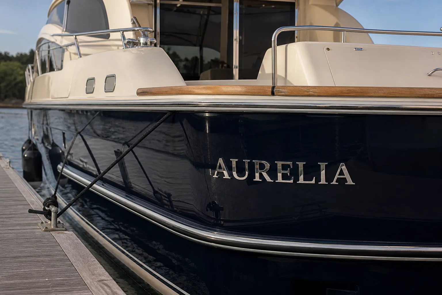
Quarter letters read from alongside docks—specify a matched port and starboard pair. Custom Yacht Signage.
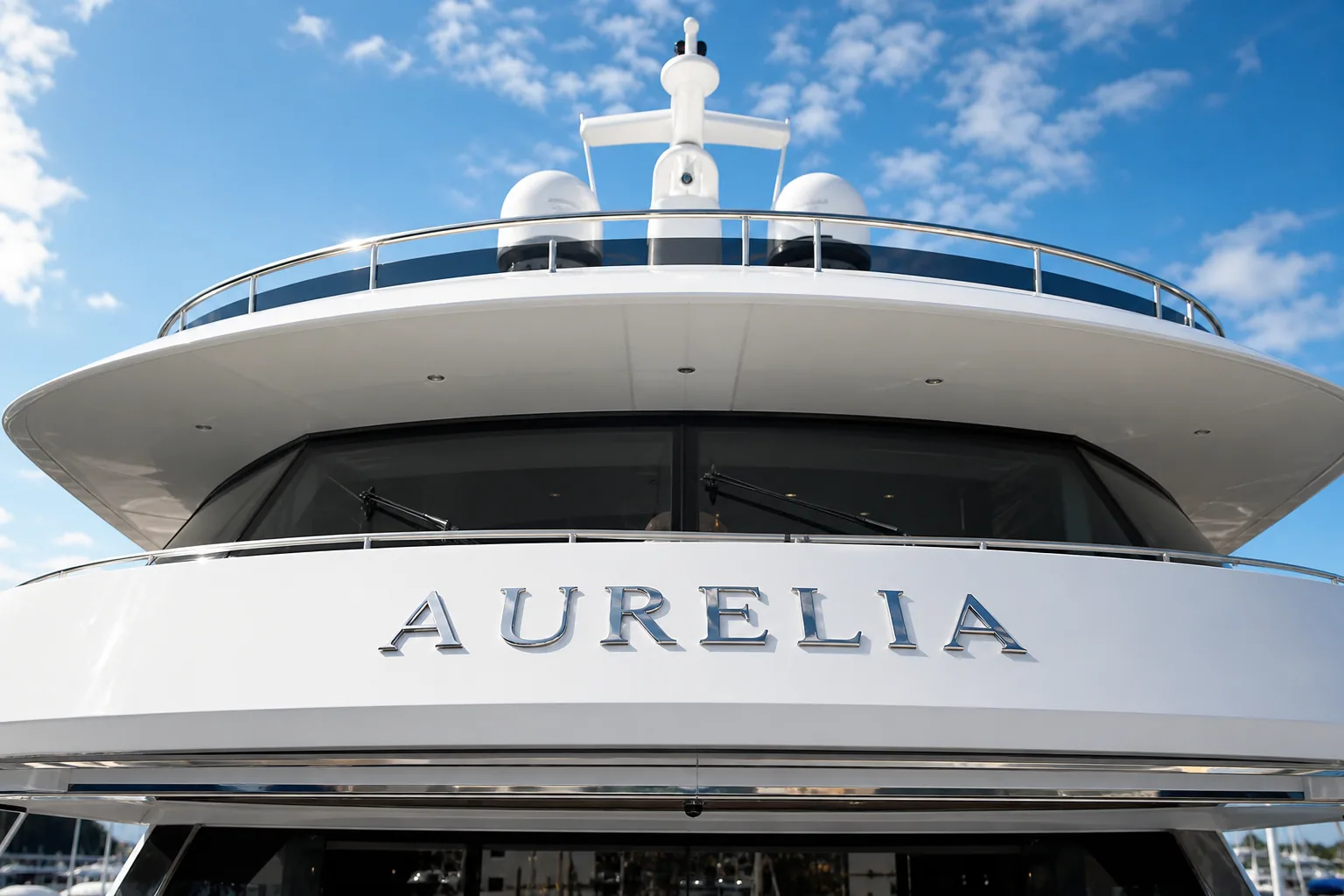
Flybridge letters add height and harbor presence; they do not replace hull marking. Backlit Yacht Signs.
Letter Size, Contrast, and Layout Proofs
Height without contrast still fails the dock test. A four-inch legal floor can be invisible on a dark hull in a busy basin; an oversized script can fail “clearly legible” even when the caliper reading is generous.
- Transom primary: size to the quiet rectangle between stairs, platforms, and hatches. Many 50–90 ft yachts land between 8 and 16 inches for the name; the port line stays smaller but legal.
- Quarters: reduce height so the wordmark fits the hull belt without crowding ports, strakes, or fender scars. Keep stroke weight readable on a curve.
- Flybridge: measure the brow, then mock full-size vinyl from the dock—not from the helm seat. Railings and radar gear steal more width than drawings suggest.
- Contrast: dark metal on dark gelcoat, or pale letters on pale topsides, is a compliance and photography risk on every location.
- Proof twice: approve a full-size layout against hull color, then dry-fit on the real surface before drilling. Position errors become permanent holes.
For glow color and intensity once size is frozen, compare options under lighting options so transom, quarters, and flybridge do not ship three different whites.
Need a transom, quarters, and flybridge layout sized to your hull photos?
Specifying a Multi-Location Program
The cleanest refit packages treat three locations as one marque with three mounting briefs—not three separate POs with mismatched fonts.
- One artwork family: same typeface, finish, and letter depth across planes; scale height per location.
- Separate electrical paths: each illuminated set needs a dedicated fused circuit, correct 12V or 24V match, and sealed penetrations. Do not daisy-chain a flybridge run off a transom harness as an afterthought.
- Access notes: transom lockers, quarter liners, and flybridge brow voids are three different install days. Photograph interiors before the fabricator freezes stud maps.
- Commissioning: day finish photos and night halo photos from astern, abeam, and below the flybridge—so the owner sees what the harbor sees.
Done well, yacht name placement reads as architecture: a legal transom that boarding officers and brokers can trust, quarters that work when you lie alongside, and a flybridge silhouette that earns its height—without drilling a single hole that the drawing never justified.
FAQ
Where should a yacht name be placed—transom, quarters, or flybridge?
Start with the legal hull mark, then add operational and branding locations. On most recreational documented yachts the transom carries the name and hailing port together. Quarters letters help side-to docks and passing traffic. Flybridge letters add height and harbor presence but do not replace a clearly visible hull marking. Many luxury programs use a transom primary plus optional matching quarters or flybridge sets.
Can a flybridge name replace legal transom lettering?
No. Flag-state marking rules require the name (and usually the hailing port) on a clearly visible exterior part of the hull—not on the superstructure. A flybridge brow, radar arch, or hardtop face is branding and night identification, not a substitute for documented hull marks. Keep the legal set on the transom or other approved hull plane, then treat flybridge letters as a second, optional program.
What letter height works on transom vs quarters vs flybridge?
Legal floors (for example four inches under USCG 46 CFR § 67.123) are minima, not design targets. Transom names on 50–90 ft yachts often run 8–16 inches so the wordmark reads from the dock; the port line stays at or above the legal floor and smaller than the name. Quarter letters are typically 60–80% of transom height so they fit hull curvature without looking like a second primary. Flybridge letters can be larger because viewing distance is greater—size them to the brow width, not to match transom inches one-for-one.
Should both port and starboard quarters carry the yacht name?
Yes, if you specify quarters lettering at all. A single-side name reads as incomplete when the vessel lies the other way on the dock or when traffic passes the unmarked beam. Match font, finish, height, and glow on both sides. Confirm fender zones, rubbing strakes, and core locations before drilling so the pair sits on fair, accessible laminate—not in a high-wear belt.
Do transom, quarters, and flybridge names all need LED illumination?
Not necessarily. Illuminate the plane guests actually approach: transom for stern-to berthing and night marina photos; quarters when side-to docks dominate the calendar; flybridge when you want a high silhouette from the fairway. Each LED set needs its own fused circuit, cable path, and sealed penetrations. A dark legal transom with a glowing flybridge looks unfinished—if budget allows only one halo, put it on the primary hull name.


